Sunday, August 28, 2011

Using Color

Of all the ways of using color contrast in quilts (and other mediums), the one that seems to confuse people the most is that of temperature. Color varies in a number of different ways: hue, value, intensity and temperature. Some would argue that temperature isn’t a true variable since a color’s temperature is always relevant to another color rather than being purely warm or cool on its own. However, in quilt making we are working with lots of colors, so strict theoretical categorization is not an issue – and, furthermore,  it’s not on the test!!

Hue, of course, is straightforward: red, yellow, blue etc whether you like the traditional 12 step color wheel or the Munsell 10 step one.

Value is how light or dark a color is: pale blue versus dark blue, etc.

Intensity is how saturated a color is: the richest colors are the most saturated, the most intense. These are nearly always of medium value. Which makes sense when you think about it…in order to make a color paler, you use less dye and so it is less saturated. In order to make a color darker you either add black, or a darker similarly hued color, or a little bit of a complementary – any of these will make the color darker, but they are also reducing the purity of the color.

And temperature?

Overall we consider yellow, orange and red to be warm. Blue and green to be cool.

Everyone understands that…but what about within a color? There are warm blues and cool ones, warm yellows and cool ones, warm reds and cool, and also warm and cool greens. What makes the difference is the little bit of color that is added to the pure hue to make it warmer or cooler.

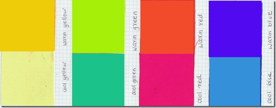
Think of cobalt blue: it’s generally considered to be a fairly neutral blue. Add a tiny touch of green (a cool color) and you get turquoise or Prussian blue, these would be considered cool blues. Add a tiny touch of red (a warm color) to a neutral blue and you get a warm blue that approaches purple (like ultramarine or royal blue).

Here are some examples I just whipped up on Photoshop:

0xx tif variations in temperature within a color photoshop

There’s another way of thinking about it that might help too. Think about a color wheel that has infinite subtle gradations between the colors…think about the blue gently shifting into green…and compare that shade of blue to the blue that is right in the middle of the blue range. The other end of the blue range is softly changing into violet. Compare the violet blue (with its little hint of red) with the neutral blue.

So we can look at color temperature in a non relative way i.e. red yellow and orange are warm, blue and green are cool. But we can also look at a specific example of a color and see that it can range from warm to cool within itself.

Okay! I hope you’ve got it now! And you’re probably thinking, well ,why do I need to have it in the first place?? Right?

Well….that’s because of the great value of using color contrast to make your art work stronger and more expressive. The impressionists were masters of color – principally because of their use of contrast. They contrasted hue, value, intensity and temperature. If you come into a lovely warm house on a freezing day it seems much cozier than if you come into that same warm house on a mild day. So you can make the warmth seem even better by the contrast. And of course in the currently overheated south east the same would hold true of air conditioning!

Furthermore, colors of different temperatures used together in a piece can create a sense of movement. Warm colors tend to advance towards the viewer, cool ones recede.

Cezanne was the impressionist painter who really used temperature contrast to manipulate form, space and light. He felt that if he placed dabs of warm and cool colors against each other they would indicate the light much more strongly that using the value contrast that had been so popular up until that time. Instead of using a darker color for something that was “further back” and a lighter color for something advancing, he used cool tones to make things recede, and warm ones to make them advance. Take a look!!

So much to learn and so little time…so if you have been, thanks for taking the time out to read this! And do please, make a comment!! Thank you, Elizabeth
Sunday, August 21, 2011

A Quilt on the Cover

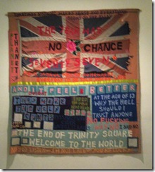
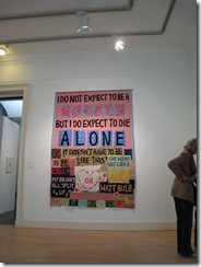
I don’t know if many quilters noticed that the August edition of Art in America has a quilt on the cover:  Tracey Emin in bed with her curator (note, he’s fully dressed!) under one of her iconic quilts.  Inside, critic Ossian Ward writes, in a review of her current retrospective, “Emin: Britain’s famous “bad girl” (she was one of Saatchi’s YBA discoveries a few years ago along with Damien half a shark Hirst) artist reveals a depth and vulnerability seldom evident in smaller samplings of her works”.

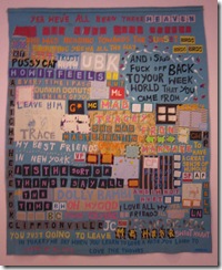
About 3 years ago I saw a Tracey Emin show in Edinburgh at the museum of contemporary art and what struck me most about the work was its authenticity and also how well crafted the quilts were.   Emin now has help to sew the quilts though she did make them herself originally: “I have a team of about six stitchers and they work for me. However, I don’t get anyone to do any sewing that I couldn’t manage myself. I do know how to do all the stitches they do – so I could make all the pieces myself, but if I did I would be a much slower artist”.  Her quilts are basically wool blankets with layers of cotton, wool and felt appliqued on top with a blanket stitch.

There were a number of quilts in the show in Scotland but the vigilance of the guards only permitted me to get three photos!  You can find plenty of Google images though and some of them will probably make you goggle as well as google!   But the strong language for which she is well known, especially when drunk, shouldn’t deter you from the obvious validity of the messages.  Yes ,she is lamenting her own life which has not been easy, but she is fighting back, hard.  Too often abused children  become permanent victims, Emin is determined not to be one even if this has led to what the critics so delicately and prissily (and, perhaps, fearfully?!) call vagina dentata

uk 08 003 uk 08 002 uk 08 001

A Tracy Emin quilt was part of the finale of the big V&A quilt show in London last year and there was at that time even a newspaper article on “how to make your own Tracey Emin quilt”!   Presumably the editor of that particular established bastion of the 4th estate felt that a cutesy appliqued cat was what quilters reading about Emin’s work would want to have!  Though it might have been much more interesting if the instructions had read “get drunk, think about some of the awful things that have happened to you in life, write them down and then cut out the letters from innocent little floral fabrics”!!!  Now that might have lead to some great follow up work!  It would be kind of fun to come up with a quilt instruction book like that now I come to think of it! (potential publishers please note my email ad is at the top right of this blog!)

Germaine Greer, who collects authentic traditional textiles from around the world,  wrote: “My treasured textiles are not art. Tracey Emin's quilts are. They exist to be exhibited, not used. At first, Emin's sewn work annoyed me, because I thought it a coarse travesty of women's craft practice, which is another case of my missing the point. Women's craft practice is one of the subjects of Emin's work, which is conscientiously imperfect.”

So what can be learned from an art quilt making the cover of AinA and from Germaine Greer’s remarks? 
And from  Emin’s work  as a whole and from her many shows, including a current major retrospective in London ? 
Firstly, I think that we should stop whining about quilts not being accepted as art! 
Secondly, that we should put our honest naked selves, the good the bad and the ugly, into our work. The stitches should reflect our humanity.
Thirdly, the images should be powerfully strong, eye catching, thought provoking, well designed and composed. 
If the work is strong enough, valid enough and different enough, it will be shown!

Well, I’d better start thinking up some instructions, so on with the kettle and the thinking cap!
If you have been, thanks for reading….love to get your comments!   Elizabeth

Sunday, August 14, 2011

Industrial landscapes

It's  ironic that as I got fed up with getting thumbs down reactions to the industrial quilts I was making and had moved onto some landscape work that I've begun to get some acceptances of them.

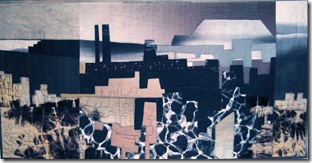
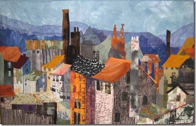
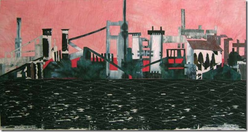
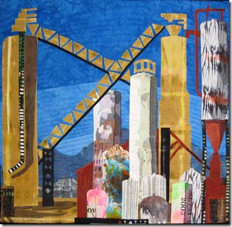
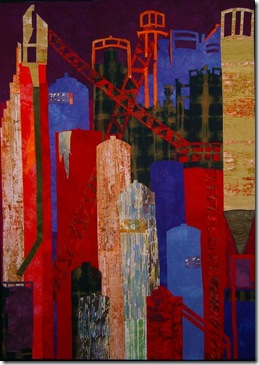
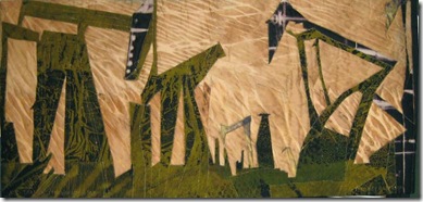
I’ve made 23 quilts featuring some aspect of industrial buildings.  Looking back, I had always responded to the weird juxtaposition of giant buildings in a a suburban setting.  Suburbia with its rows of identical houses gives off fumes of dullness, dreariness, predictability, inexorably depressing.  But these strange giant creatures hovering on the horizon offer an SF fantasy like intrigue.   As I recall,  there has nearly always been some fascinating industrial building in my life!

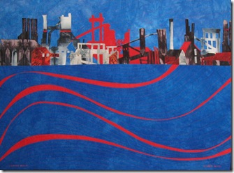
My first memory is of the gasometer at the end of our street when I was growing up.  You don't see them often now , but gasometers were like giant tanks held within a framework of lacy iron scaffolding.  The domed tanks rise and fall as (I presume) they fill/empty with gas.  I've never actually made a quilt based on the gasworks, but I've incorporated that ironwork idea into a few other things. .ofortuna72

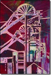
My grandfather was a miner and I regret the taking down of the old winding wheels, the memorials to those brave and desperate dedicated men.  The old wheels of fortune dropping tokens on warm hearths, or black lungs.


milltown After my young gasometer phase I then worked in a huge Victorian chocolate factory that spread over acres and acres, it must have been about half a mile from the entrance to the technical library where I worked, picking out images for chocolate boxes and laboriously (and probably in accurately!) translating articles about cocoa bean agriculture.

. milltownmorning72

Then my next jobs were working in long stay hospitals in the moors of Yorkshire.  I would drive pas many old mill workings with their tall elegant brick chimneys, a dynamic contrast to the wide undulating expanses of the moors.


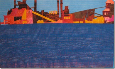
rusty answer Visiting Canada, I drove through Hamilton, Ontario and saw the steel mill across the lake.  The water is usually choppy and textured, the horizon is wide, and the mill stretches widely along the shore with more nad more variations of diagonals.


strangebeauty


steelyardfrieze cement works

In my home town in Georgia, I discovered an old cement works hiding behind a newly gentrified boulevard of older Southern homes with wide porches and rocking chairs.

red abandon100


And on a trip west , I saw these funky little drills, bobbing up and down in the fields like demented old cows, sipping the bounty of the earth. 

all that glitters is not gold


These different shapes and lines, odd pokey buildings, spires of metal and walkways of lacy iron, towers of brick and cement provide great possibilities to the designing quiltmaker!  But responses from shows, and galleries and viewers have up to now been pretty negative: reject, reject reject, "we can't sell those", "why would anyone want to make a quilt about that" "what strange colors you use" etc
and so I must admit the Muse stumbled a bit...and empty landscapes with no polluting (and let's face it they do, however complicatedly beautiful the shapes) factories or utility works began to seem more interesting, and I'm definitely wanting to move into unencumbered space. 

And then, wouldn't you know it, dear old Mr Sodslaw comes along: accept, accept, accept, will you send us one or two or more for our gallery in a power plant, for our steam museum, for the World Financial Center.....
So the Muse is looking right and left and right again at the tennis match of public taste wondering who will take the title this year!  I'll wait and see what she decides!!

If you have been, thanks for reading!!  And if you run a power plant or some wonderful industrial facility, consider buying some great art work for the board room!  or, even better, the main assembly hall.

As always, I love to get comments!   Elizabeth

Sunday, August 7, 2011

Inspired to Design? use your knowledge!

What inspires us to design?  I’m not asking what images do we find beautiful, intriguing and inspirational.  Instead, I mean what is it that will make us sit down and make a proper job of designing an art piece?  There are many “design guidelines’ with which I’m exceeding familiar  but in the heat of the moment, or very often, on my part through sheer laziness, I say oh what the heck and just plunge in!  And in nearly every case I am soon confronted with a mess.  So then I spend ages and ages trying to fix it and simply end up with an overworked mess!! I think this can happen in any medium, so the solution to this might be found in any medium.  I can aim to improve my eye and my working process with mediums other than fiber if only unfibrous opportunities present themselves.  As they have!

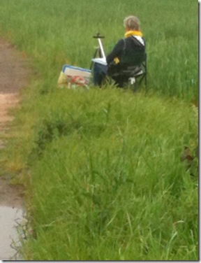
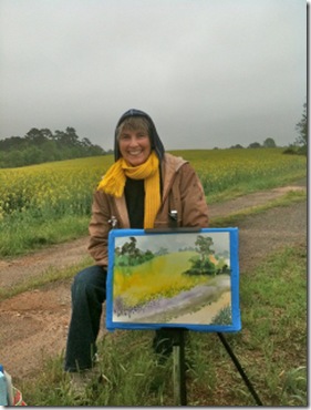
For, as well as practice, we all need feedback, and the more informed the feedback the better.  I give  a lot of feedback in my classes, both in reality and online, but I realise I need it for myself too.  In my situation I’ve found it more helpful to get feedback from people who work in other mediums because they’ll address the compositional issues.  Another quiltmaker would be inclined to focus more on the stitching or technical issues.   So I joined a plein air painting group.  My cogitations led me to the idea that if I came up with a good design or selection of colors while composing and painting in the fresh air I could translate those to a quilt design.  Now this is a keen group of people working in many different mediums: oil, acrylic, watercolor, pastel, colored pencil, sumi-e ink, photography, collage, mixed media and sculpture.  (so obviously they needed a textile person too!) The leader of the group drives around the area seeking out inspirational views and then we are all emailed with a time and destination!  It’s great fun and one is much more inspired to design in the company of others.  As well as not feeling like a blinking idiot sitting on one’s own sketching on a muddy farm track or  in the botanical gardens!

esb apr 11 plein air a

esb apr 11 plein air b


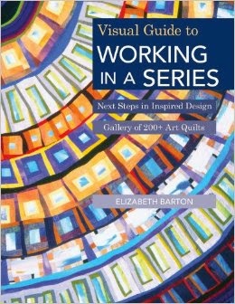
Everybody sets about the task with great seriousness, and because we will all share the results at the end of the morning, I find I set to with proper intention and am much less inclined to mess about.  Also there’s the added fact that the computer, email and scrabble games don’t work in the middle of a field of canola! I’ve learned a lot from being in this group.  It makes me really use the knowledge I have.  I was reminded of this by a comment from a student in my ongoing Working in Series QU class.  She said: “thanks for Lesson 3. It's great! I may have read most bits of information,  but I found it very very useful to have it together, supported with lots of your personal examples”.  It’s no good just knowing it, you have to practice it too!

Registration is still open for my next Inspired to Design class at QU but only for a few days since the class begins on Thursday.  I am so grateful for  how much I’ve learned from teaching!

Use the knowledge! 


And, if you have been, thanks for reading, I’m headed off to a grass verge somewhere!     Elizabeth
PS All feedback is sooooooooooo helpful…please, just hit the comment tag and speak!